Sync The City '24: Designing Brightpaths in 54-hours
Dec 8, 2024

I was part of the ‘Brightpaths’ team for the 10th anniversary of Sync the City, a 54-hour startup event in Norwich. This was my first experience of the event, and I really enjoyed its fast-paced nature. Being surrounded by like-minded, forward-thinking people who are passionate about building the future and unafraid to think differently was inspiring.
Why I chose to work on this idea.
The idea was first introduced by Colin during his 1-minute pitch, where he shared his vision for an AI Copilot designed to support children in education. I chose this project because I believe technology should serve as a tool to enhance learning, rather than a source of distraction for young people. Fundamentally, future-facing technology must be designed to work in harmony with children, empowering them rather than hindering their development.
The Problem:
Our team of about 10 came together, bringing different backgrounds, abilities, and knowledge. After discussions on Friday morning, we narrowed our focus to a small subset of the education system we wanted to address: safeguarding and wellbeing in education. The idea was to create a tool that would allow teachers and administrators in schools to track students’ moods and flag any concerns.
The team was exceptional, and the software design was built around their incredible work—gathering research, speaking with headteachers, and sharing insights through conversations.
My job was to take their findings and reflect them in a simple, user-friendly interface.
My Design Process:

Wireframes:
Given the fast-paced nature of the event, I knew the best approach to creating wireframes and a user flow for this interface was to keep things as simple as possible. The focus was on stripping everything back to highlight the key elements of each screen.
I designed two user journeys within the wireframes: one for students and one for teachers.
Students’ Journey: Students begin by selecting their name or avatar, then answering a question related to either safeguarding or wellbeing, tailored to their individual circumstances. They receive feedback to confirm their response has been successfully submitted.
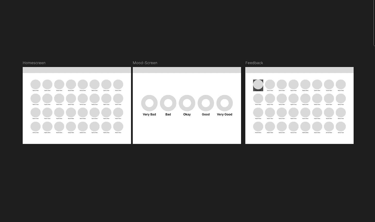
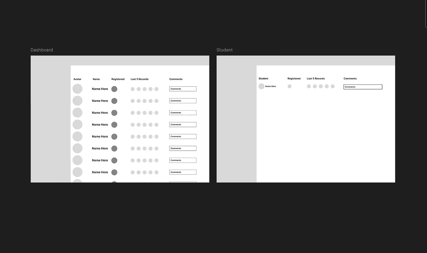
Teacher's Journey: Teachers interact with a dashboard that provides a summarised overview of their class, highlighting trends or concerns related to safeguarding and wellbeing.
The next step was validating these designs. We presented the screens to a headteacher, which helped confirm some of our design assumptions and introduced additional ideas to incorporate into the higher-fidelity stage.
High-Fidelity
By mid-afternoon on Friday, it was time to move into the next stage and create higher-fidelity versions of the wireframes. With limited time for user testing, I focused on developing an MVP, stripping back features on each page to keep the design as minimalistic as possible.
Karun, a talented first-year UX student at Norwich University of the Arts, worked on creating avatars for the students, which added character and brought the design to life. Karun also designed the logo, and once the brand colour was chosen, we implemented it throughout the user interface.
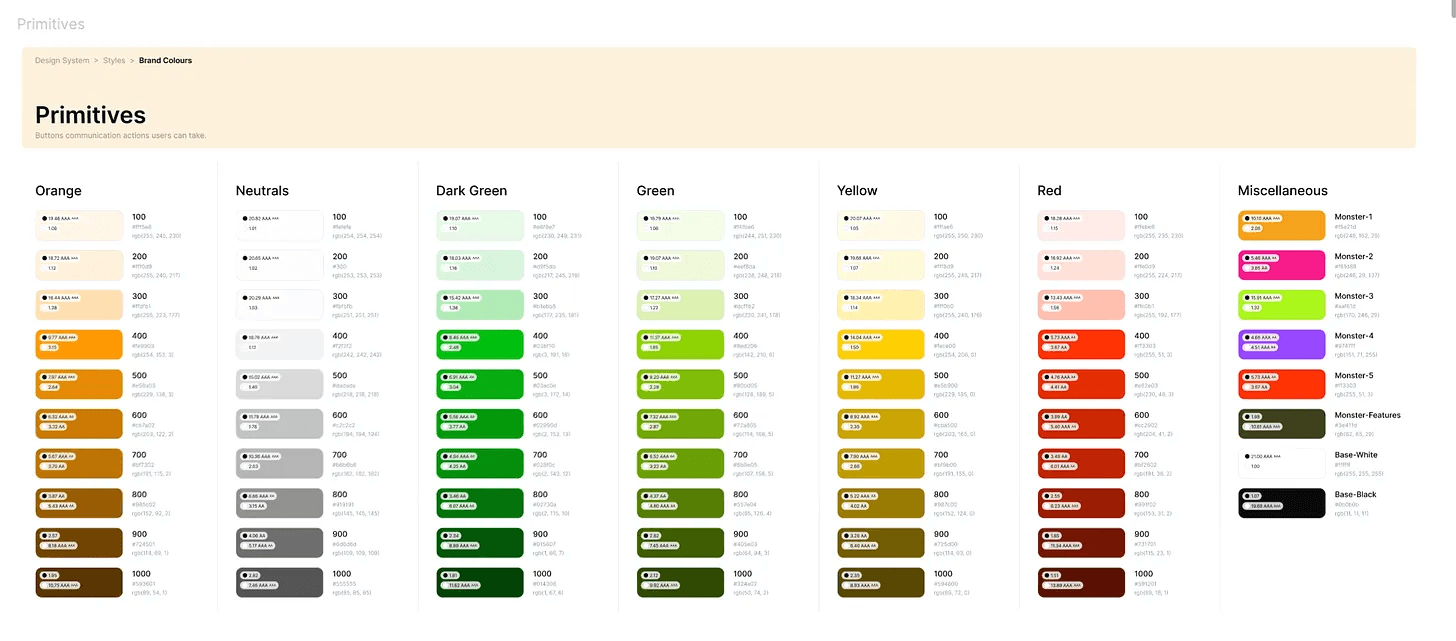
Using the orange from the logo, I developed an initial colour palette to unify the platform’s look and feel. Orange was selected for its ability to convey comfort while also stimulating the brain, aligning perfectly with the platform’s purpose.
Here’s the initial colour palette:
To enhance engagement with the younger audience, I decided to place the avatars within circular frames, which would later be animated. The avatars were integrated into clickable cards, maintaining rounded edges throughout the design. Rounded edges were intentionally chosen for their association with safety, approachability, and friendliness—key qualities I wanted the design to reflect.


Variables and Styles:
Once the high-fidelity screens were completed, it was time to refine the design by creating a small design system.
I started by using variables to define the colours of the application, ensuring every element in the user interface was carefully considered. This process began with creating Colour Primitives—a collection of core colours and their variations. These were then distilled into tokens to further unify the system and streamline its application.

Next, I introduced Spacing and Padding variables, ensuring all elements adhered to the 4-point grid system I had implemented. This helped maintain consistency and alignment throughout the interface.

Finally, I opted to use Text Styles instead of defining them through variables. Given the time constraints and the need to prototype the app to demonstrate its functionality, this approach balanced efficiency with quality.

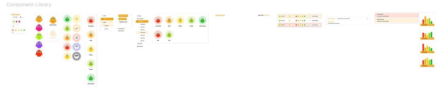
Components
With a little time remaining, I decided to organise a small component library using the elements I had created during the high-fidelity stage. This approach meant that when adding variables, I only needed to apply them to the components themselves, significantly speeding up the process on a global scale.
The component library was then connected using Figma's prototyping links, enabling me to build a fully interactive prototype of the experience within the 54-hour timeframe.
Reflection
While I’m pleased with the design of the interface, I believe it’s a true reflection of how the team connected around this idea to create an MVP. Some aspects, such as accessibility, still need attention, but with user testing, these challenges can be addressed.
I worked closely with Karun (Designer) and Gary (Software Engineer) throughout the process, ensuring everything we designed would function seamlessly during development. I also appreciated the push from Dave, David, and Steve, who made sure there was a clear rationale behind every element I added to the design.
In every project I complete, I believe the attention to detail is what truly brings an idea to life. From social media assets to the pitch deck, the user interface, and even the brand guidelines, every element contributes to the bigger picture. We certainly pushed the limits of what could be achieved in 54 hours, and next year, it will be about improving upon what we accomplished this time.
Here’s the winning Final-Pitch by Colin!